The new wxrks is live. What do you think?
Hi everyone.
Today we launched a new design for wxrks. It is our first big redesign since 2022. If you translate in wxrks every day, you will notice it first in the editor.
Here is a quick tour. At the end, we have a question for you.
(Want the full story, with every before and after? Read the full release on our website.)
The editor
The editor is where you spend most of your day, so it got the most care.
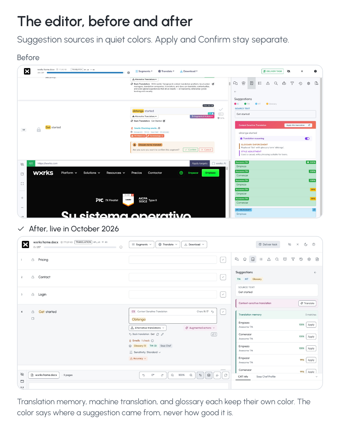
You can see where each suggestion comes from. Translation memory, machine translation, and the glossary each have their own soft color.
The color tells you the source, not the quality. Deciding if a suggestion is good is still your call.
Apply and Confirm are separate. Apply puts the text in the segment. Confirm is your decision about it.
Smells, Sous-Chef, and your glossary and memory matches sit right under the segment, where you need them.
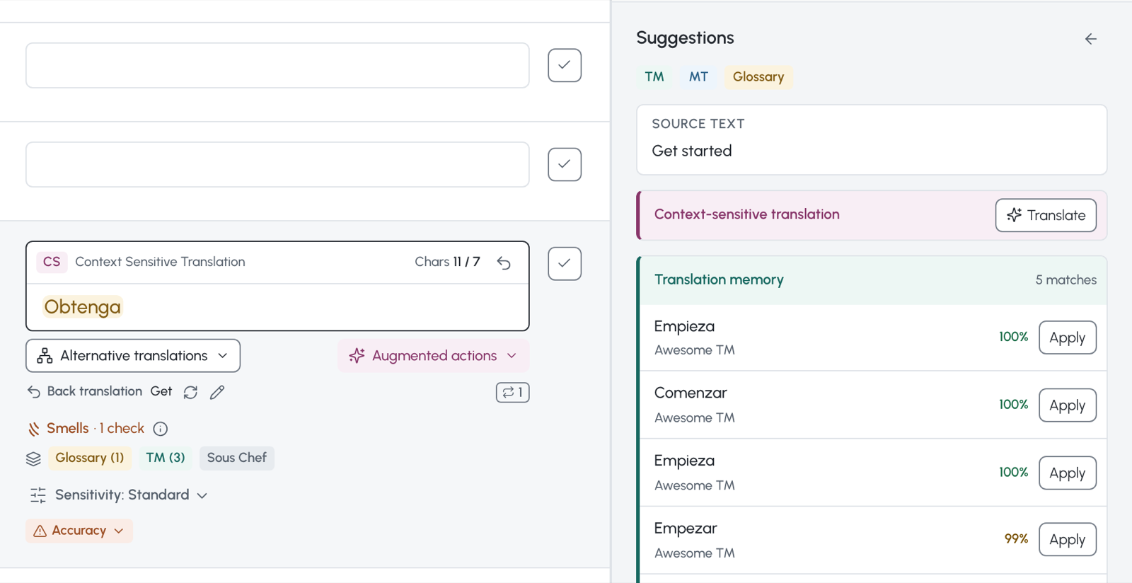
Here is the editor before and after the redesign.
Your projects
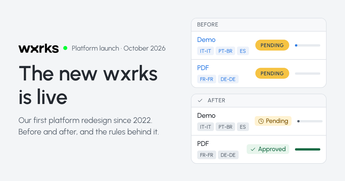
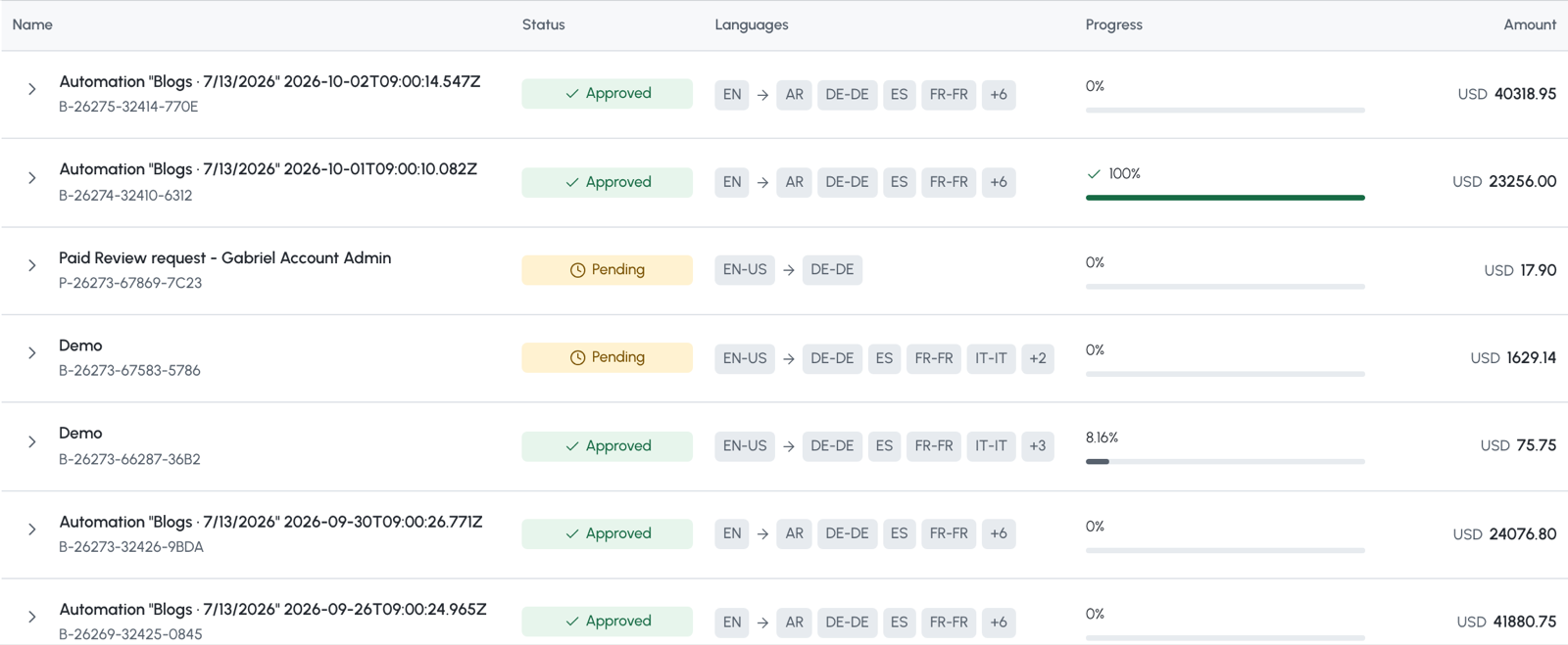
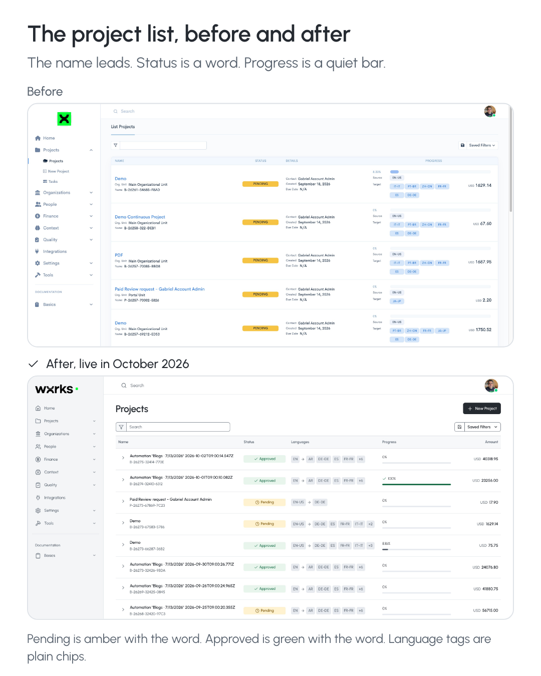
The project list is calmer too. The project name comes first. Status is a word, like Pending or Approved, instead of a bright yellow block. The progress bar turns green only when the work is done.
And the project list before and after.
Why we changed it
The old design served us for four years. But every year we added more to it. Smells, Sous-Chef, alternative translations, continuous projects, and much more. Each new feature made the screen a little busier.
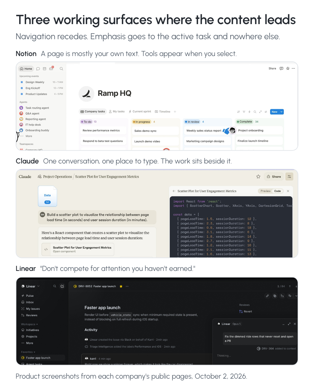
We wanted your translation to be the first thing you see. So we studied tools many of you already use, like Notion, Claude, and Linear. They all keep your work in the middle and move everything else out of the way.
Nothing is gone
Your projects, translation memories, glossaries, and settings are all where you left them. Only the look changed.
Tell us what you think
This is where we need you. Leave a comment below and tell us:
What do you like?
What feels strange, or harder than before?
Is there anything you cannot find?
If something is not working the way it should, tell us here or in the chat inside wxrks. We read every comment.
Want the full story, with every before and after? Read the full release on our website.
1 comment
So proud of this, especially because we as a team have found a way to do it. We all know how hard it is to deploy a big change like this, how exposed our work gets. The chance of something breaking is high, but the opportunity to do things better is way bigger than keeping things the way they are. Glad to be part of this, glad that we overcame that together. Can’t wait to see what you all are gonna say about it.